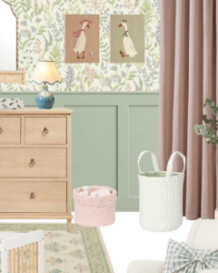
Girl Nursery Ideas That Are Not Pink: Five Beautiful Colour Schemes
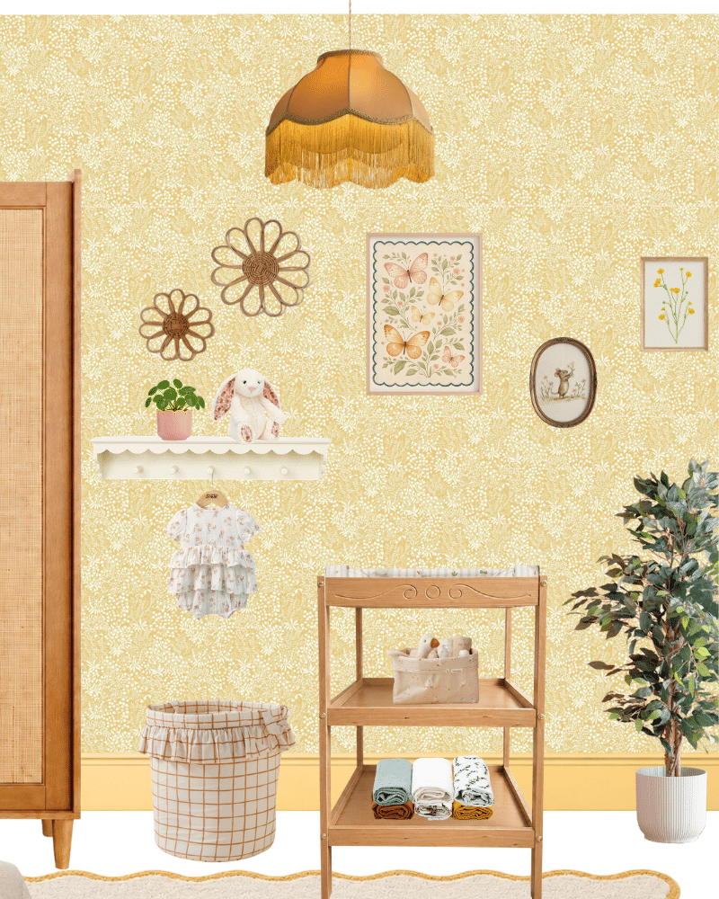
Pink has long been the traditional choice when decorating a baby girl’s nursery. However, there are plenty of other colours capable of creating a welcoming and feminine room. Today, parents are increasingly looking beyond blush walls and endless rose-coloured accessories. Instead, they want nurseries with longevity that are calm, considered and cocooning.
With this post, we present five thoughtfully designed girl nursery ideas that are not pink and achieve exactly that. Each is driven by their own distinct colour palette. Some are light and playful while others are cosy and traditional, yet all have the potential to grow gracefully beyond the newborn months. In addition, each of the nurseries comes with specific paint recommendations, styling suggestions and a curated list of shoppable pieces that will help you recreate the look in your own home.
We assembled each moodboard using products currently available to the UK, where we are based. However, we have also included alternative pieces available to readers in North America that capture the same overall aesthetic.
Please note: this post may contain affiliate links, which means we may earn a small commission if you purchase through them, at no extra cost to you. We only recommend products we genuinely think work beautifully together.
Why choose a colour other than pink for a girl’s nursery?
Selecting an alternative colour palette doesn’t mean avoiding femininity. In fact, quite the opposite.
Soft lavender can feel enchanting and storybook-like. Vintage blue creates a calm, elegant backdrop that has been used in children’s rooms for centuries. Butter yellow brings warmth and optimism. Sage green offers a gentle botanical feel. Meanwhile, terracotta introduces richness, depth and warmth without overwhelming the space.
Perhaps more importantly, these colours typically age remarkably well. Many families will transition naturally from nursery to toddler room with only a few decorative changes, making these colours practical choices as well as beautiful ones.
Throughout these moodboards, you will notice a common approach. Colour may be the inspiration, but the rooms’ personalities are built through meaningful and carefully layered textures, materials, furniture, lighting and decorative details. The result is a collection of nurseries that feel inviting and full of character without being overly themed or sugary.
1. The Lavender Storybook Nursery
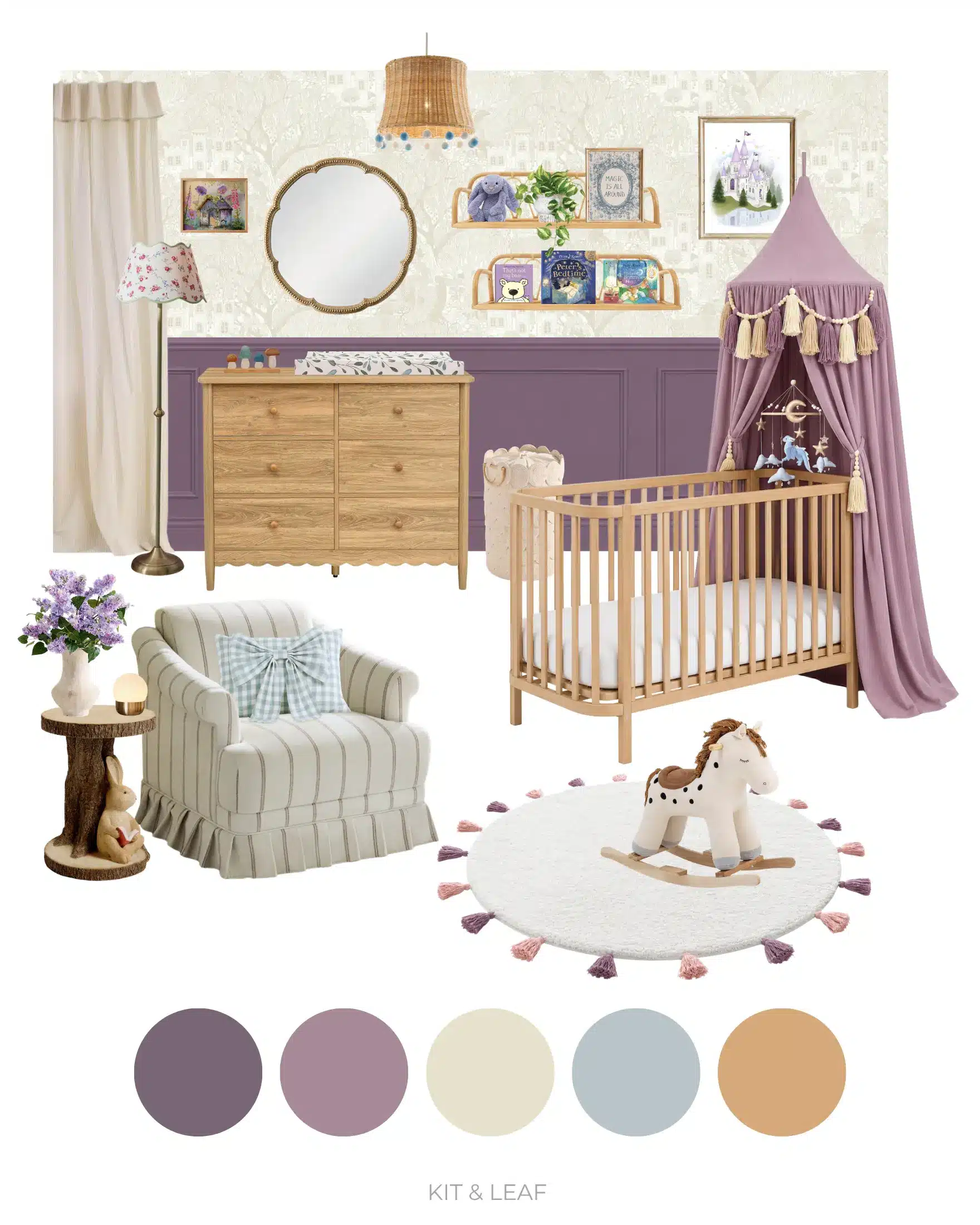
This lavender nursery is whimsical and quietly magical, without relying on the usual pink princess palette for its femininity.
The starting point is the soft mauve panelling, which gives the room the colour depth to feel distinctive and serve as a calm backdrop for your baby. Above it, the delicate neutral wallpaper introduces foliage, castles and tiny illustrated details that feel as though they could have been lifted from the pages of an old storybook.
The most theatrical element is undoubtedly the lavender canopy over the cot. It gives the nursery a sense of occasion and fantasy, but because the colour is muted and the surrounding furniture remains natural and understated, it stops short of feeling overly themed. Instead, it creates a cosy little focal point for sleep, stories and eventually imaginative play.
Natural wood brings warmth through the cot, dresser and shelving, while cream curtains, a softly striped nursing chair and a pale rug prevent the deeper mauve from making the room feel heavy. Muted blue appears in smaller details, including the gingham cushion, while wicker, trailing greenery and the rustic side table add a slightly woodland quality.
Books and artwork do much of the storytelling. Castle imagery, favourite children’s books, soft toys and small decorative objects make the room feel imaginative without needing crowns, carriages or overt princess motifs.
This nursery would suit anyone who wants a baby girl’s room to feel romantic and enchanting, but would prefer something more individual than the traditional pink nursery. It has a fairytale quality, certainly, but one that feels more universal, closer to a much-loved illustrated book than a themed princess bedroom.
The Lavender Storybook Colour Palette
This moodboard uses:
- Deep muted lavender
- Soft mauve
- Warm cream
- Misty blue-grey
- Natural oak
Lavender and mauve provide the room’s main colour story, but using two related shades gives the scheme more depth than a single lilac tone throughout.
Warm cream is particularly important. It appears across the wallpaper, curtains, rug and upholstery, creating plenty of light space around the stronger purple tones and preventing them from becoming overly sweet.
The muted blue-grey is a smaller accent, but one we particularly like. Purple and pink would have been the obvious combination; blue makes the palette feel fresher and slightly less predictable. Meanwhile, natural wood introduces warmth and keeps the room connected to the earthy, storybook quality of the wallpaper.
Lavender Storybook Nursery Paint Colours to Try
Lavender can be surprisingly tricky to choose from a paint chart. Cooler versions can become quite blue in certain light, while warmer lilacs can quickly begin to read pink, so we’d always recommend trying tester pots in the actual nursery first.
Lavender or mauve panelling
- Farrow & Ball Brassica
- Benjamin Moore Carolina Plum
- Dulux Vestige
Rather than choosing a very pale lilac, we’d lean towards a slightly muddier, greyer lavender for this particular look. The added depth helps traditional panelling feel architectural and allows the lighter wallpaper and furniture to stand out against it.
Warm cream and off-white
- Farrow & Ball School House White
- Benjamin Moore Swiss Coffee
- Little Greene Slaked Lime – Mid
For this moodboard, we’d use the lavender on the lower portion of the walls with wallpaper above. The contrast is what gives the room much of its character: the painted panelling grounds the more whimsical wallpaper while also making the ceiling feel lighter and higher.
If you don’t want panelling, the same effect could be achieved with a simple half-painted wall running the length of the room, perhaps with a scalloped edge. Alternatively, use the wallpaper on one or two feature walls behind the main pieces of furniture, paired with an appropriate off-white paint for the remaining surfaces, then carry the lavender through the room’s woodwork, i.e. the skirting boards, and the window and door frames.
Shop the Lavender Storybook Nursery Moodboard
Here are the key pieces to recreate this nursery look:
Click to shop the look
Cot canopy
Panelling
Wallpaper
Tasseled rug
Light wood cot
Flower vase
Faux lilac bundle
“Magic all around” artwork
Floor lamp
Rattan wall shelf x2
Scalloped mirror
Light wood dresser
Changing mat
Bashful bunny plush toy
Artificial devil’s ivy
Rustic vase for faux ivy
“That’s not my bear” book
“Peter Rabbit’s Bedtime” book
“Bedtime Bunny Hunt” book
Pom Pom Lampshade
Curtains
Rabbit side table
Cream laundry bag
Vintage striped nursing chair
Blue gingham bow cushion
Whimsical cottage print
Castle print
Rocking horse toy
Touch table lamp
Dragon felt mobile
Wooden stacker toy
Why This Lavender Storybook Nursery Works
There is quite a lot happening in this nursery. However, it never feels especially busy because the strongest elements all have very different jobs.
The wallpaper establishes the storybook setting. The lavender panelling gives the room structure. The canopy provides one dramatic focal point. Everything else can therefore remain comparatively quiet. How much you introduce to the space from that point on is up to you.
Natural wood furniture is particularly effective here. We considered how the scheme might look with painted furniture, but ultimately the oak tones stop the lavender from saturating the space. It also warms the room and helps connect some of the more rustic, fantasy details, including the wicker house basket, wooden shelving and tree-stump side table.
Texture then softens the more decorative elements. Frilled curtains, upholstered seating, tassels on the rug and canopy, woven storage and trailing greenery make the nursery feel tactile and comfortable rather than staged.
The canopy also deserves some additional restraint. It’s already a strong statement, so we’ve avoided surrounding the cot with lots of superfluous wall decorations. The mobile provides movement beneath it, while the neighbouring artwork and books carry the storybook theme into the room.
We deliberately resisted making every accessory purple. Repeating lavender too often would flatten the scheme, whereas the cream, blue-grey, green, brass and, yes, a few tiny pops of pink give it some space to breathe.
What we like most about this room is that its sense of magic isn’t particularly age-specific. The cot will eventually disappear and the books will change, but the wallpaper, panelling and canopy could just as easily form the backdrop to a toddler’s reading corner.
The result is a nursery that is imaginative without being novelty-led, feminine without depending on pink and just fantastical enough to make bedtime feel like the beginning of a story.
2. The Vintage Blue Nursery
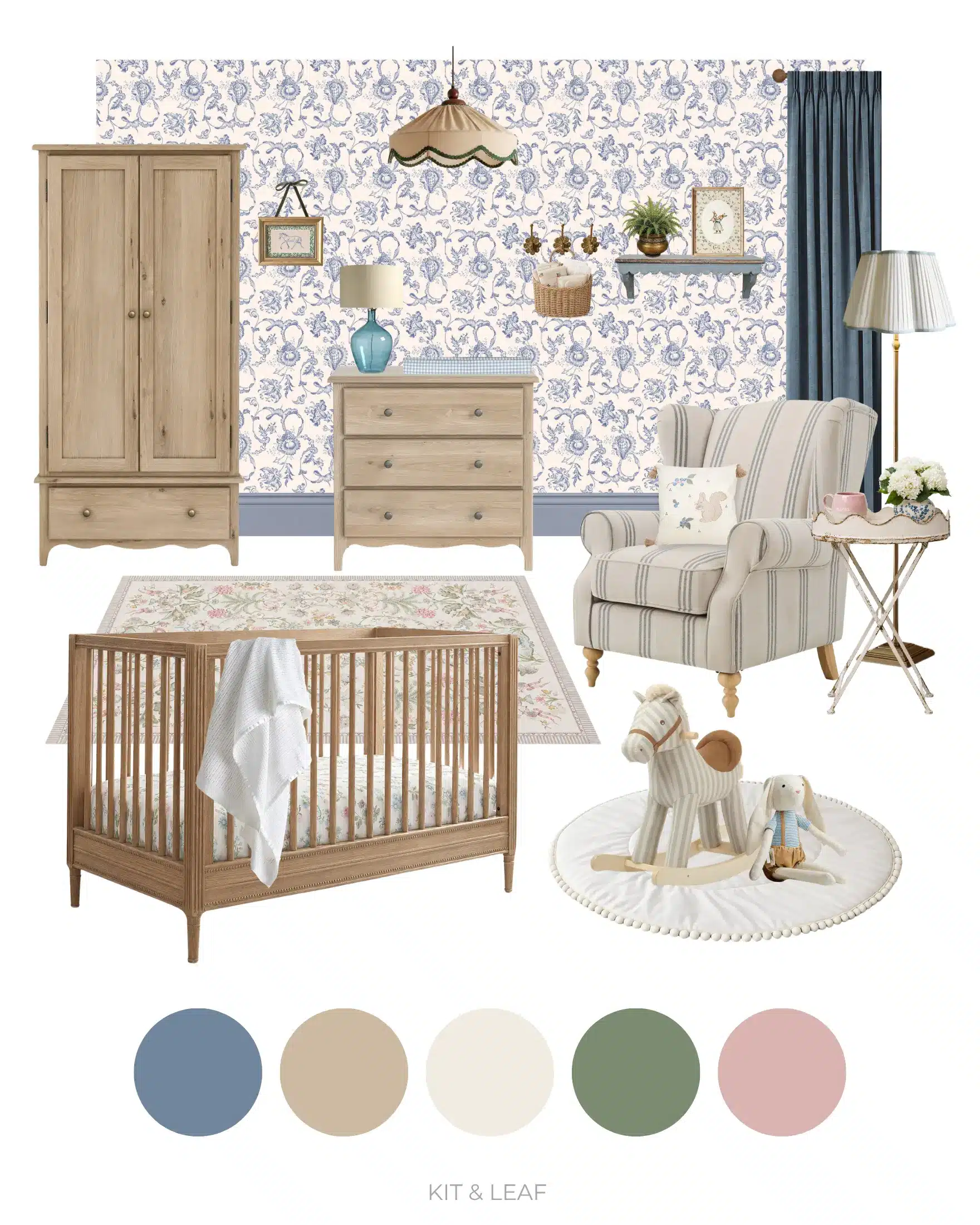
Up until the mid-twentieth century, blue was widely accepted to be a more feminine colour, while pink was reserved predominantly for boys. The aggressive retail marketing practices of the 1940s and 50s then flipped this stereotype on its head. However, this means that blue is a near-perfect colour to accurately capture the elegant, heirloom feel of a historic girl’s nursery.
Naturally, blue is a cooling colour. So, to bring in the necessary warmth, this scheme layers powder blue, warm cream, natural oak and delicate floral details. The blue floral wallpaper immediately sets the tone. Rich in detail without feeling busy, it creates a gentle, repeating backdrop that complements the painted skirting below. Together, they frame the room, giving it structure and allowing the decorative elements to shine.
Natural, limewashed wooden furniture keeps the room feeling authentic rather than overly polished. The cot, wardrobe and dresser all have a handcrafted quality, while the scalloped rug, embroidered bedding, woven baskets and linen curtains introduce layers of texture that are soft and welcoming.
Although this nursery leans traditional, it avoids becoming old-fashioned. Clean-lined furniture, thoughtful lighting and restrained styling ensure the space still feels fresh enough for modern family life. This design would suit parents looking for a nursery that feels calm, classic and intentionally collected rather than trend-led.
The Vintage Blue Colour Palette
This moodboard uses:
- Heritage blue
- Limewashed oak
- Warm ivory
- Sage green
- Soft powder pink
Although blue naturally takes centre stage, we’ve tried our best to ensure it never overwhelms the room. Instead, it behaves almost like a soft neutral, allowing warmer colours and natural materials to provide balance.
The ivory keeps the room feeling light, while the oak furniture introduces a subtle earth-tone. Small touches of sage green, woven rattan and antique brass also prevent the scheme from becoming overly cool. This introduces a layered, lived-in quality that feels richer than a simple blue-and-white nursery.
You’ll notice that pink is present, albeit in small quantities. It felt unnatural to force the colour out of the room entirely, particularly where including it could complement and elevate the surrounding colours.
Perhaps the biggest surprise is just how adaptable the palette is. While every element has been chosen with a baby girl in mind, none feels overtly themed or overly juvenile, meaning the room can evolve naturally as your child grows.
Vintage Blue Nursery Paint Colours to Try
These paints aren’t intended to exactly replicate the moodboard, but they’ll help you achieve a similar heritage-inspired feel. As always, sample colours first, since natural light can drastically alter the appearance of blue paints.
Heritage blue woodwork and wallpaper tones
- Farrow & Ball Parma Gray
- Little Greene Grey Stone
- Benjamin Moore Oxford Gray
Warm white walls and/or details
- Farrow & Ball School House White
- Little Greene Portland Stone – Pale
- Benjamin Moore Swiss Coffee
For this look, we used Farrow & Ball’s Parma Gray for the room’s skirting. We recommend using the same blue for all of your room’s woodwork, whether that’s typical elements like window and door trim or more purpose-built features like tongue-and-groove panelling. Wainscoting is particularly helpful if a fully wallpapered room feels too busy. Alternatively, you might consider papering only the wall behind the cot and then painting the remaining walls in a warm white or soft cream. This keeps the floral pattern as a feature while maintaining the calm feeling that makes the nursery so relaxing.
Shop the Vintage Blue Nursery Moodboard
Here are the key pieces to recreate this nursery look:
Click to shop the look
Wallpaper
Double pinch pleat curtain
Curtain rod
Seadrift convertible cot
Washed oak double wardrobe
Washed oak dresser
Pendant lamp
Stately floral rug
Natural stripe armchair
Blue floral stoneware vase
Artificial hydrangea bunch
Blue glass table lamp
Distressed accent shelf
Antique floor lamp (base)
Scalloped lamp shade
Soft rocking animal toy
Blue floral cushion
Heirloom bunny
Framed blue horse artwork
Blue gingham changing mat
Set of 3 brass floral hooks
Changing station hanging basket
Cellular baby blanket
Floral fitted sheet
Round playmat
Tray table
Mother rabbit artwork
Ancient Greek design brass planter
Why This Vintage Blue Nursery Works
One of the biggest strengths of this nursery is its restraint. Nothing shouts for attention. Instead, every piece quietly supports the next.
The wallpaper provides pattern, but the blue woodwork beneath gives the eye somewhere to rest. The furniture is decorative but not too ornate, while the wood tones themselves warm the room. The use of textiles also ensures the room feels more comfortable than precious: an heirloom blanket draped across the cot; a floral fitted sheet; soft, gathered curtains; a tasseled cushion; scalloped fabric lampshades; a pom-pom-ringed play mat. Together, these soften the architectural elements of the room.
The lighting itself deserves particular mention. Fabric shades diffuse a gentle glow across the room, while the table and floor lamps can be used to introduce layers of warmer light, perfect for late-night feeds or bedtime stories. Together, they create a softer atmosphere than a single overhead fitting ever could.
We also intentionally avoided filling every available surface. Rather than overstuffing shelves and table tops with dozens of decorative accessories, we chose a handful of more tasteful pieces, including two framed prints, a stoneware vase of hydrangeas, a woven basket and a favourite soft toy or two (with the rocking horse for them to grow into). A vintage-inspired nursery works best when each object has room (and time) to breathe.
Ultimately, what makes this nursery feel special isn’t simply that it’s blue. It’s that every element shares the same quiet confidence. The floral wallpaper, traditional panelling, natural wood, soft textiles and heritage-inspired details all tell the story of a room that feels as elegant today as it will in many years’ time.
3. The Butter Yellow Nursery
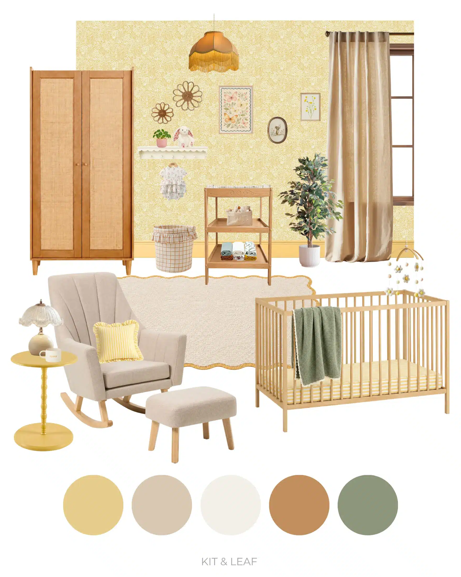
Inspired by the soft warmth of early morning sunlight, this baby girl’s room feels uplifting from the moment you walk through the door.
Unlike stronger yellows, butter yellow has a creamy quality that behaves almost like a warm neutral. It reflects natural light beautifully, making even smaller nurseries feel brighter and more open, while still introducing enough colour to feel joyful and full of personality.
Above the painted skirting, which wraps the bottom of the room in a warm buttery hue to lift the space, delicate floral wallpaper adds femininity with subtle movement.
Natural light- and mid-toned furniture keeps the palette suitably grounded, neither blending into the yellow nor contrasting with it too heavily. Meanwhile, the various soft textiles around the room bring a sense of calm. Gentle touches of peach, muted green and warm caramel then appear throughout the accessories, providing additional depth without distracting from the sunshine palette.
The Butter Yellow Colour Palette
This moodboard uses:
- Butter yellow
- Warm oatmeal
- Soft chalk white
- Natural honey oak
- Muted sage green
Although yellow is the dominant colour, the surrounding palette ensures it never overwhelms the room. The creamy undertones stop it from becoming harsh, while the oak furniture introduces a different kind of warmth and texture to further relax the ambience. Muted sage green echoes the botanical details within the wallpaper and helps connect the palette to the natural materials used throughout the room. Small touches of peach, meanwhile, gently reinforce the feminine feel without taking the nursery back towards pink.
Together, these colours create a bright and cheerful girl’s nursery, while maintaining the calm atmosphere that is so important in a baby’s bedroom.
Butter Yellow Nursery Paint Colours to Try
These paint colours should help you achieve a similar warm, light-filled nursery.
Soft butter yellow woodwork
- Santa Monica Graham & Brown
- Little Greene Light Gold
- Dulux Heritage Butter Cup
Warm white walls
- Little Greene Slaked Lime
- Benjamin Moore Simply White
- Edward Bulmer Grace
Butter yellow works particularly well on traditional woodwork because the architectural lines help give structure to the relatively neutral colour. Pairing it with a softer wallpaper above keeps the room feeling layered rather than simply the same yellow all over.
We would go with Santa Monica in eggshell finish for the skirting, as it is the closest butter yellow hue recommended by Graham & Brown to pair with their Daisyfield Creme Brulee Wallpaper. Very close in colour, but just dark enough by comparison to form a clean, accentuating border. On the other hand, if wallpapering isn’t your style, then consider painting the walls a warm off-white. The task of introducing the necessary dollops of butter yellow will then fall to textiles, artwork and toys instead.
Shop the Butter Yellow Nursery Moodboard
Here are the key pieces to recreate this nursery look:
Click to shop the look
Yellow spindle side table
Ruffled stripe cushion cover
Yellow and cream scallop rug
Rocking chair with footstool
Daisy cot mobile
Yellow pattern fitted cot sheet
Mouse wall art
Hand drawn buttercup botanical
Relaxed natural linen curtain
Honey-coloured changing table
Light oak rattan wardrobe
Rattan wall flowers
Pink scallop edge planter
Frilled romper
Scalloped shelf and peg rail
Dimmable petal table lamp
Nappy caddy
Large storage basket
Sage and oat baby blanket
Blossom cream bunny ‘Berry’
Muslin cloth sets
Goose pattern changing mat
Amber satin lampshade
Artificial ficus tree
Beech cot
Butterflies print
Daisies and butter yellow wallpaper
Why This Butter Yellow Nursery Works
The biggest strength of this nursery is the feeling it creates.
Yellow is often overlooked in bedroom design because people worry it will feel too bright or overstimulating. In fact, we ran into this very issue when we painted the primary bedroom in our first house a sandy yellow. The problem was that we had no vision at the time – no overarching direction for the rest of the room. So, against our light brown sisal carpets, white skirting and grey, driftwood bed frame, the yellow felt jarring and overly rich.
This is why having a colour palette that works and a moodboard that makes sense are vital to bringing out the best in a butter yellow baby room. When all elements work together cohesively, you can create a space that feels hopeful, welcoming and full of gentle optimism: qualities fitting for the days and months leading up to and after the birth of your child.
The skirting provides enough colour to give the room identity, while the slightly lighter wallpaper above prevents the space from becoming visually heavy. The floral pattern introduces detail without dominating, allowing the furniture and textiles to remain focal points.
Natural materials also play an important role. Oak furniture, woven storage baskets, linen curtains and cotton bedding all soften the palette. These tactile elements also stop the yellow from becoming overly sweet and instead give it a quiet, lived-in warmth.
Like the other nurseries in this collection, the accessories have been chosen with restraint. Rather than filling every corner with decorative objects, each piece contributes either texture, colour or function. The result is a nursery that feels bright enough to lift your mood, yet calm enough to become part of everyday family life.
4. The Floral Sage Green Nursery
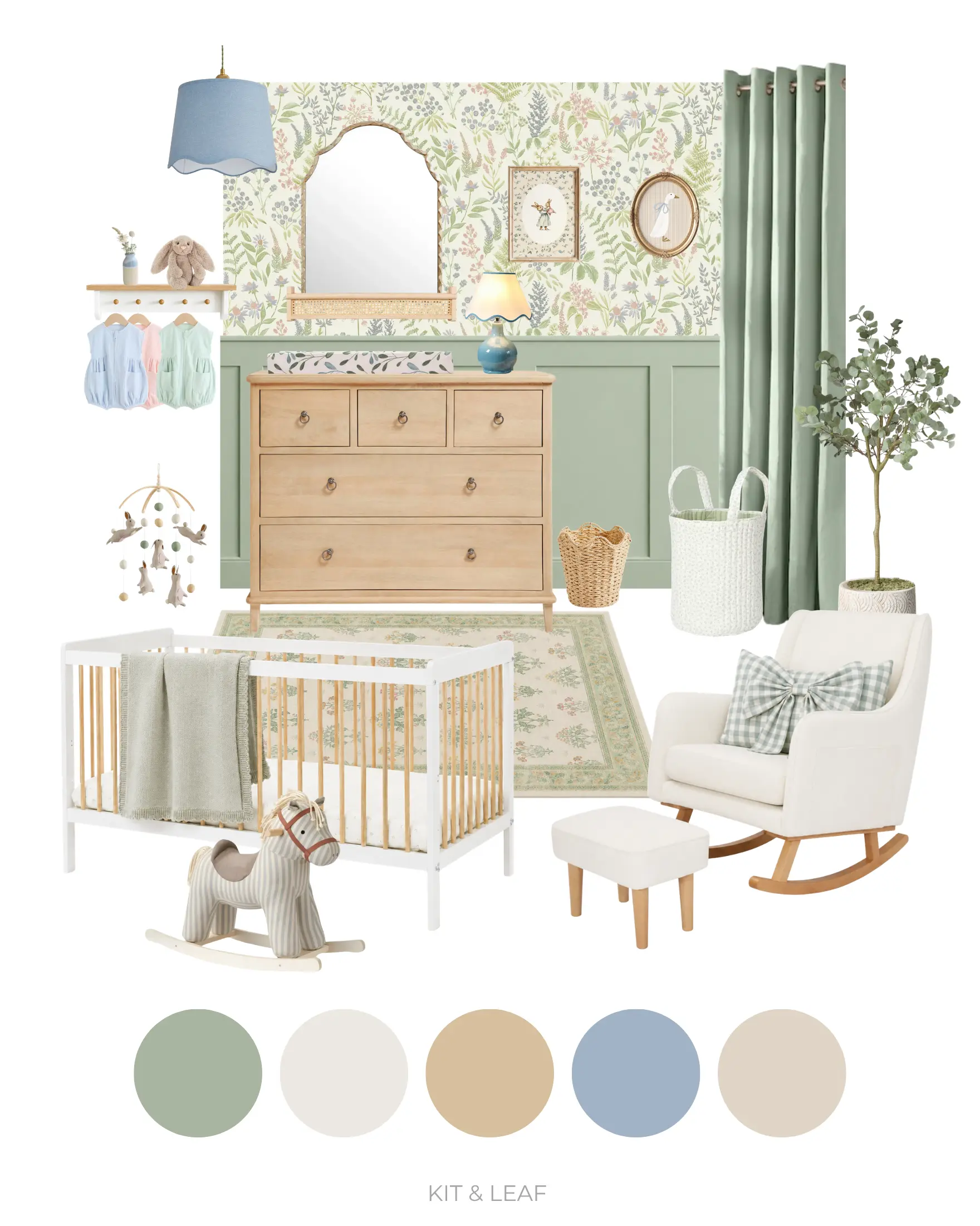
Our soft floral sage green nursery has a slightly different story from the other rooms in this collection.
If you’ve already explored our Sage Green Nursery Ideas guide, you may recognise it. That’s because this design began life as one of the three moodboards featured in that article. And, somewhat unexpectedly, it has since become our most popular nursery on Pinterest by quite a margin.
After watching thousands of users save and engage with the original design on Pinterest, we began wondering what they were responding to most. Was it the floral wallpaper? The calming sage green panelling? The traditional furniture? Or was it simply the balance between femininity and practicality?
To find out, we revisited the moodboard and made a series of thoughtful changes. Pink accessories were replaced with softer sage green alternatives, the styling was refined and the overall palette was made more cohesive, creating a nursery that feels every bit as elegant while relying even less on traditionally feminine colours.
The result is this updated floral sage green nursery.
It still feels gentle, romantic and unmistakably designed for a little girl, but now places sage green firmly at the heart of the scheme. Delicate botanical wallpaper, painted panelling and natural wood furniture create a room that feels peaceful and timeless, while carefully chosen textiles and decorative pieces add warmth without overwhelming the space.
For parents who love floral nursery ideas but would prefer something less obviously pink for their baby girl, this strikes a particularly happy balance.
The Floral Sage Green Colour Palette
This moodboard uses:
- Soft sage green
- Warm ivory
- Natural oak
- Dusty blue
- Mushroom
Although sage green now leads the palette, the supporting colours remain important. Ivory and natural oak keep the room feeling light and grounded, while restrained touches of dusty blue introduce just enough contrast to stop the scheme from feeling flat.
Rather than competing for attention, the colours gently echo one another throughout the room, allowing the wallpaper to remain the visual centrepiece.
The overall effect is calm, layered and quietly feminine: proof that a nursery doesn’t need large amounts of pink to feel soft or welcoming.
Floral Sage Green Nursery Paint Colours to Try
These paint colours might not replicate the moodboard exactly in your space (dependent on natural light), but they’re the best starting point for recreating its soft, botanical atmosphere.
Sage green panelling
- Farrow & Ball Lichen
- Little Greene Aquamarine Mid
- Dulux Fresh Sage
Warm white walls
- Little Greene Slaked Lime
- Benjamin Moore Simply White
- Edward Bulmer Grace
For this look, we’d use sage green across traditional panelling or the lower half of the room, allowing the floral wallpaper to sit comfortably above. If you’d rather avoid covering every wall in pattern, the wallpaper works beautifully as a feature behind the cot or dresser, with the remaining walls painted in a warm off-white or very pale sage.
Shop the Floral Sage Green Nursery Moodboard
Here are the key pieces to recreate this nursery look:
Click to shop the look
White / light wood cot
Light wood dresser
Meadow green rug
Nursing chair (with footstool for UK)
Gold arched wall mirror
Rattan floating shelf
Floral sprig wallpaper
Faux eucalyptus tree
Light beige planter
Bouncing bunny mobile
Shaker style peg shelf
Pale sage blackout curtains
Blue detail table lamp
Waste paper basket
Blue gingham bow cushion
Pendant lamp shade
Soft rocking animal toy
Wainscoting kit
Vintage goose wall art
Bashful beige bunny
Sage green laundry basket
Chunky sage baby blanket
Pastel baby romper set
Olive leaf changing mat
Ceramic bud vase
Mother rabbit artwork
Why This Floral Sage Green Nursery Works
Some nursery colour schemes rely on dramatic contrast to create interest. This one takes the opposite approach.
Everything has been chosen to feel harmonious.
The floral wallpaper introduces movement and detail, while the sage green panelling provides visual structure to slow things down again. Pale oak furniture keeps the overall scheme light, and soft woven textures help balance the painted surfaces.
Perhaps most importantly, the colour palette feels reassuringly simple. Instead of introducing lots of competing accent colours, the same handful of tones are repeated in different ways throughout the room, through bedding, artwork, curtains, storage baskets and decorative accessories. That repetition gives the nursery a sense of quiet cohesion that’s difficult to achieve by accident.
It’s also a good example of how a room can evolve without losing what made it successful in the first place. By refining rather than reinventing the original design, we’ve created a nursery that feels familiar to those who loved the first version while offering an alternative for parents who want sage green to take centre stage.
Ultimately, it’s easy to see why this style has resonated with so many families. It combines traditional charm with a fresh botanical palette, creating a nursery that’s elegant, calming and practical enough to enjoy well beyond the baby years.
5. The Earthy Terracotta Nursery
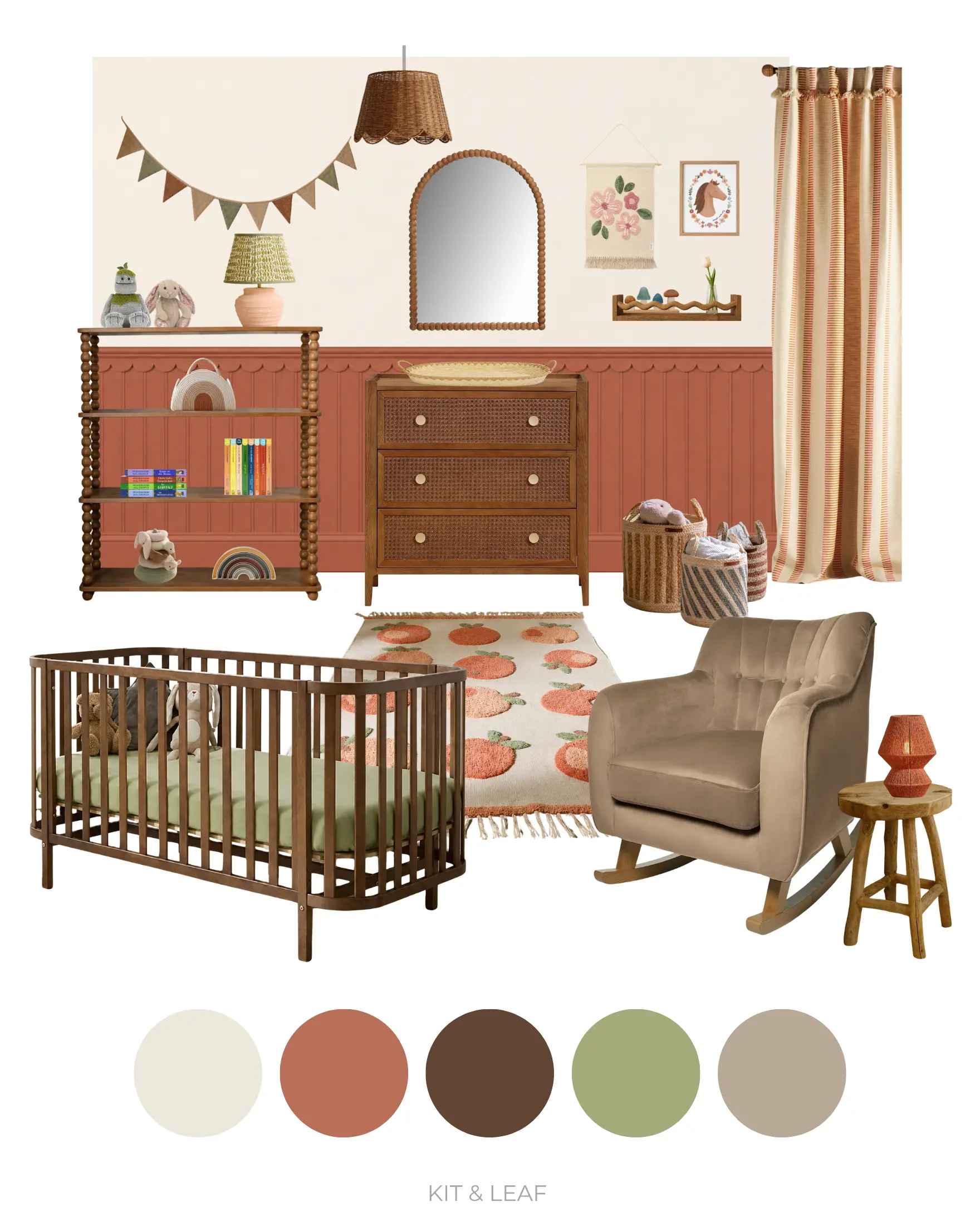
Our earthy terracotta nursery is the richest and most grounded of the five designs in this collection. Warm clay tones, natural wood, woven textures and botanical details combine to create a baby girl’s room that feels cosy, characterful and quietly sophisticated.
Terracotta isn’t the most obvious choice for a nursery, which is perhaps exactly why we love it. Inspired by sun-baked landscapes and handcrafted materials, it brings a welcome blend of warmth and calm to the room. Rather than feeling too bold, the muted clay tones wrap the space in a gentle sense of comfort suited to quiet afternoon naps and bedtime stories.
At the heart of the design is the beautifully reeded and scalloped terracotta panelling, which gives the room much of its architectural character. Above it, the walls are painted simply, although a plaster effect could be achieved to introduce movement, or a softly illustrated wallpaper to achieve whims, against the solidity of the timber below.
Darker walnut furniture keeps the palette feeling rooted and organic, as does the consistent use of curves throughout the various furnishings. Small olive green accents woven throughout the room then help reinforce this connection to nature but stop the scheme from feeling too warm or one-dimensional. Layers of linen, boucle, wicker and knitted textiles also work to soften the stronger wall colour.
Although undeniably feminine, this nursery achieves that feeling through warmth, texture and thoughtful styling rather than traditional pastel colours. It’s a baby room that feels timeless rather than trend-driven, and one that could grow naturally alongside its little occupant for years to come.
The Earthy Terracotta Colour Palette
This moodboard uses:
- Warm ivory
- Muted terracotta
- Chocolate brown
- Muted olive
- Mushroom taupe
The palette is built around balance.
Terracotta provides warmth and depth. Chocolate (walnut brown) wood tones introduce further layers of warmth, and, crucially, neither disappear into the bold background nor detract from it. This is because the ivory and taupe prevent the room from becoming visually heavy.
Olive green appears sparingly through accessories, artwork and textiles, giving the entire palette an even fresher, natural quality.
Together, these colours create a nursery that feels earthy, welcoming and full of quiet confidence.
Earthy Terracotta Nursery Paint Colours to Try
These paint colours will help you achieve a similarly warm and natural look.
Terracotta panelling
- Benjamin Moore Audubon Russet
- Graham & Brown Arizona Sky
- Farrow & Ball Red Earth
Warm neutral walls
- Farrow & Ball School House White
- Edward Bulmer Frankie
- Knuckles Paints Culinary
The tricky thing with terracotta is that certain shades can tend towards rose and darker pink. We instinctively shied away from these towards terracottas with more red and orangey-brown undertones, while still not landing directly on these colours either. Perhaps the reason terracotta works so well is that it can dance between each of these similar tones depending on the light in the room, whilst also keeping its own identity intact.
Terracotta works particularly well when used on architectural features such as tongue-and-groove or reeded panelling, where the interplay of light and shadow naturally soften the colour’s richness. Pairing it with a lighter wall colour above helps lift the eye and prevents the room from feeling enclosed or cave-like. Our moodboard features a combination of Audubon Russet and School House White to achieve just that. Natural timber, woven fibres and plenty of soft fabrics are equally important, ensuring the finished room feels tactile and practical rather than stony and staged.
Shop the Earthy Terracotta Nursery Moodboard
Here are the key pieces to recreate this nursery look:
Click to shop the look
Scallop dado rail trim
Reeded tongue and groove panelling
Walnut rattan dresser
Floating wiggle shelf
Floral tapestry
Walnut convertible cot
Pieced stripe curtain (coral)
Wicker scallop pendant shade
Walnut spindle bookshelf
Small terracotta table lamp
Natural animal stacker
Inspiring biographies board book set
Rainbow woven nappy caddy
Rust/beige rug
‘Rockleton’ plush toy
Blossom beige bunny ‘Petal’
Striped woven storage baskets
Natural teak stool
Strength and beauty horse print
Tabletop changing basket
Burnt orange jute table lamp
Montessori stacking rainbow
Wooden arch mirror
Soft brown nursing chair
Wooden stacker toy
Julia Donaldson board book set
Earth colours bunting
Why This Earthy Terracotta Nursery Works
Arguably, the room works because of the interplay between texture and colour. The reeded panelling with scalloped trim immediately draws the eye, introducing rhythm and shadow that give the walls far more interest than a simple painted surface. Above it, the warm white walls add contrast through simplicity, which also prevents things from becoming too busy.
The furniture has also been kept rather understated. Clean silhouettes allow the rich wall colour to remain the star of the room, while tactile fabrics invite softness into every corner.
Lighting also plays an important role. Diffused lighting through terracotta, chocolate and sage green lamp shades helps enrich the room’s earth tones, allowing the palette’s focal point to shift gently throughout the day with each activity.
What we particularly love about this nursery is its versatility. While undeniably designed with a little girl in mind, there’s nothing overly age-specific about the room. As your child grows, the larger design decisions, such as the panelling, bookshelves, rug, dresser and lighting, could remain exactly as they are. Only the artwork, bedding and decorative accessories would need to evolve over time.
This nursery also demonstrates two things. Firstly, that feminine design doesn’t need to rely on pastel colours to create a gentle, soft and calming aesthetic. And, secondly, that boldness, balance and strength are all equally feminine qualities, and fully achievable in a baby girl’s nursery through the considered use of terracotta.
Girl Nursery Ideas That Aren't Pink FAQs
I'm worried my nursery won't feel "girly" enough without pink. How can I soften the look?
It’s a common concern, but colour is only one part of what makes a room feel feminine. Floral patterns, gentle curves, natural textures, soft lighting and thoughtfully chosen accessories often have a much greater influence than the wall colour itself. Throughout this collection, we’ve used everything from scalloped rugs to botanical artwork and linen fabrics to create nurseries that feel unmistakably designed for little girls without relying on a predominantly pink palette.
Which of these colour schemes is likely to age best?
All five have been designed with longevity in mind, but the sage green, vintage blue and terracotta schemes are probably the easiest to adapt as your child grows. Muted colours generally transition best. By keeping the larger elements—such as the panelling, furniture and wallpaper—fairly timeless, you can then refresh the room over the years simply by changing bedding, artwork and decorative accessories as your child’s interests move on.
Should nursery furniture match?
Not necessarily. Coordinating furniture, even loosely, often creates a more relaxed and collected appearance than buying a complete matching set. Choosing pieces that share similar materials, proportions or finishes usually feels more natural and gives the room greater lived-in character.
Do I need to copy an entire moodboard?
Not at all. Think of these moodboards as starting points rather than shopping lists. You might fall in love with the wallpaper from one nursery, the cot from another and the colour palette from a third. Mixing ideas to suit your own home is often what creates the most personal and successful spaces.
I love one of these rooms, but some of the products aren't available anymore. What should I do?
Retail collections inevitably change over time, so don’t worry if a particular item has sold out. Focus on the overall feeling of the room rather than finding identical products. If you’re struggling to source something specific, leave us a comment. We’re always happy to suggest alternatives that capture the same look.
Which nursery would you choose if you were starting from scratch?
Honestly, there isn’t a right answer—that’s why we created five completely different designs. Some parents are naturally drawn to the calmness of sage green, while others prefer the warmth of terracotta or the timeless elegance of vintage blue. We’d encourage you to think less about what’s fashionable and more about which room feels like somewhere you’d genuinely enjoy spending time during those long feeds, cuddles and bedtime stories.
Final Thoughts on Girl Nursery Ideas That Aren’t Pink
Before you start decorating, here’s some advice…
If you’re decorating from scratch, resist the temptation to buy everything at once. Start with the biggest decisions (wall colour, wallpaper and furniture) then live with the room for a little while before choosing accessories. The most interesting nurseries are those where the pieces feel gradually accumulated rather than perfectly assembled in a single shopping trip.
Which moodboard surprised us the most?
Before we started designing this collection, we’d probably have guessed that lavender or sage green would become our favourites. Instead, we found ourselves repeatedly drawn back to the historical realism of the vintage blue scheme, but then ultimately won over by the boldness of the terracotta room. That’s one of the reasons we always encourage people not to choose a nursery colour from a paint chart alone. Once furniture, wallpaper, lighting and textiles come together, a colour can feel completely different to what you first imagined.
Designing a nursery without relying on pink doesn’t mean sacrificing warmth or femininity.
In many ways, it opens up even more possibilities. Whether you’re drawn to the whimsical charm of lavender, the timeless elegance of vintage blue, the cheerful optimism of butter yellow, the botanical calm of sage green or the earthy richness of terracotta, each palette demonstrates a different way to create a baby girl’s room that’s full of personality.
Across all five moodboards, the same principles remain consistent. Thoughtful colour palettes, natural materials, layered textures and practical furniture create spaces that feel beautiful without becoming overly styled. Rather than chasing short-lived trends, we’ve aimed to design nurseries that feel comfortable to live in, easy to adapt and capable of growing alongside your child.
Whichever direction you choose, remember that the best nursery is the one that feels welcoming every time you walk through the door. If these moodboards help you discover a colour you might never have considered before, then our work here is done. Or maybe it’s just getting started.
P.S. If you’ve enjoyed this post, you might also like to explore some of our other nursery collections centred around colour. These include our deeper look into Sage Green Nurseries as well as our three interpretations of a Lemon Themed Nursery.